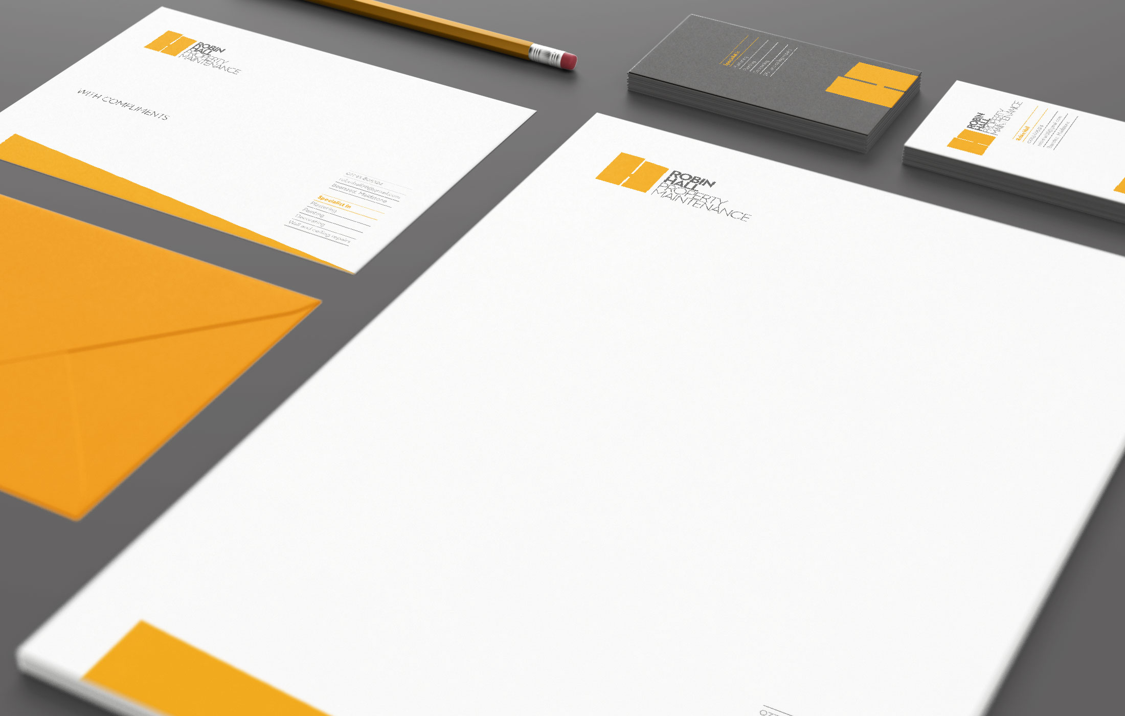
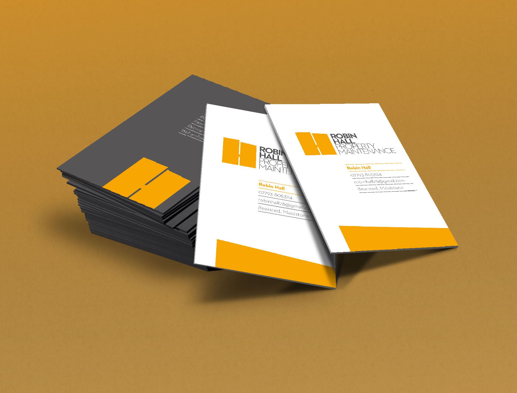
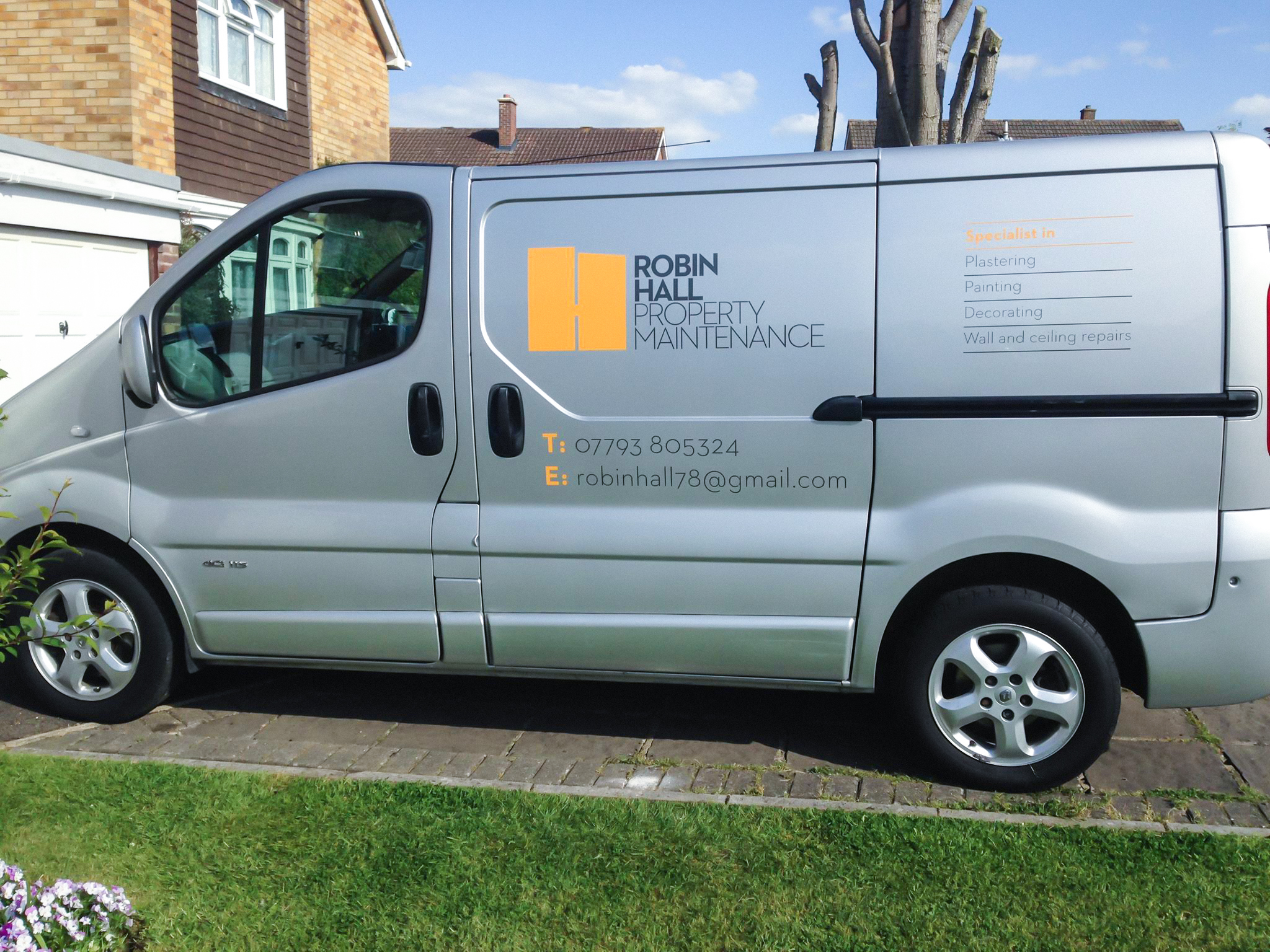
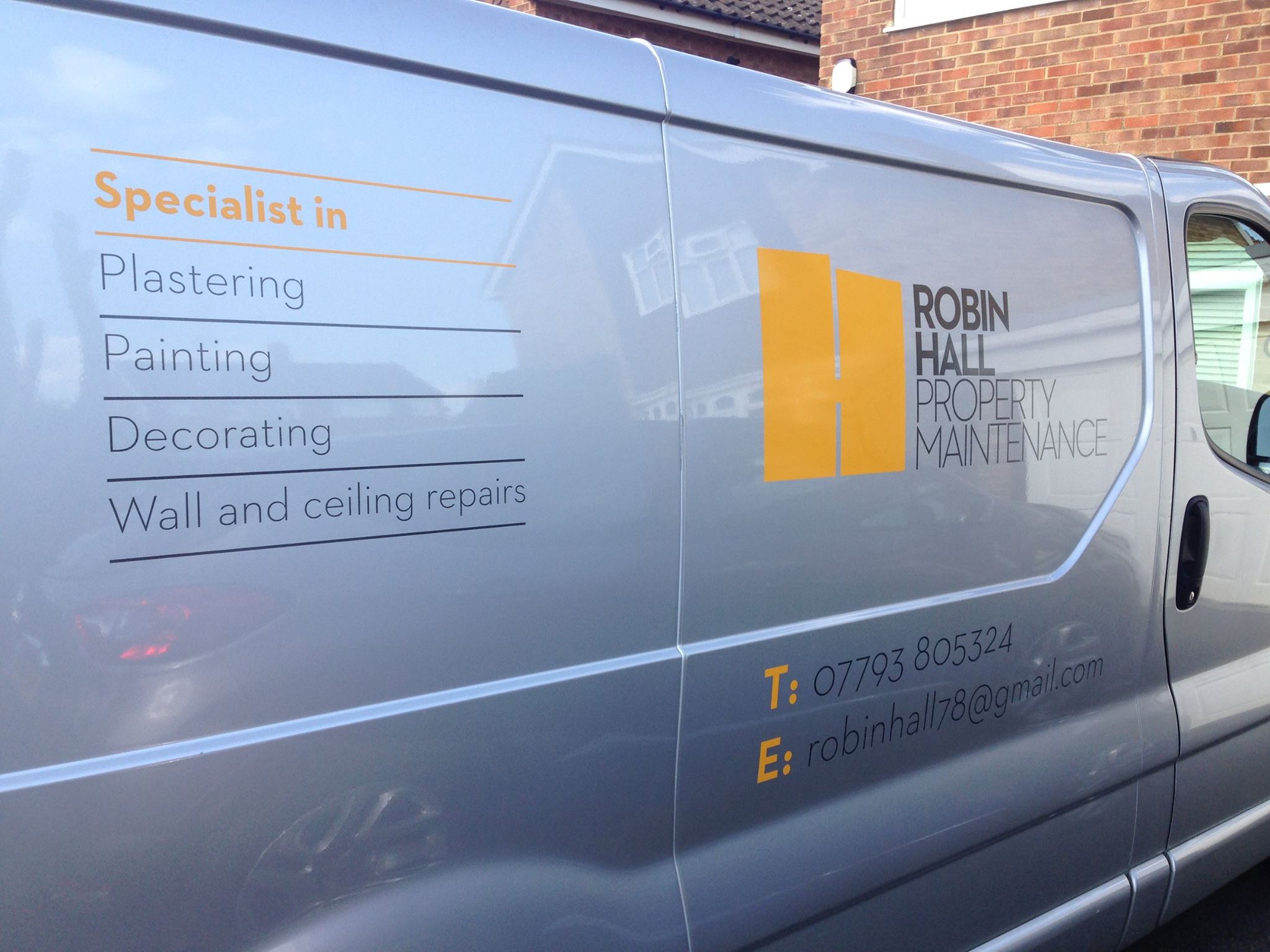
Robin Hall Property Maintenance
I was asked to create the first professional brand identity for this thriving local business.
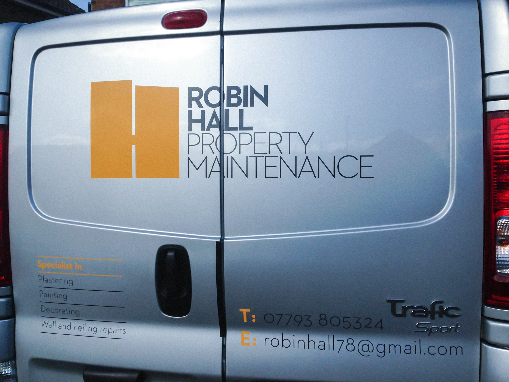
I decided to simply represent some of the services offered by Robin's business and I did this by constructing a strong, sturdy letter 'H' which looked as though it could have been rendered with a paint roller, or even a plasterer's trowel.
This was partnered with clean, simple typography and a pared down two-colour palette of orange and graphite.